1) Charm and character, similar to our previous studio.
2) This time a storefront, surrounded with like-minded businesses.
3) Its own bathroom.
4) A gallery space, tall walls, and room for events.
5) Room to grow.
6) Adequate natural light with opportunities for photographing inside.
7) Minimal build-out expense.
The before and in progress photos:
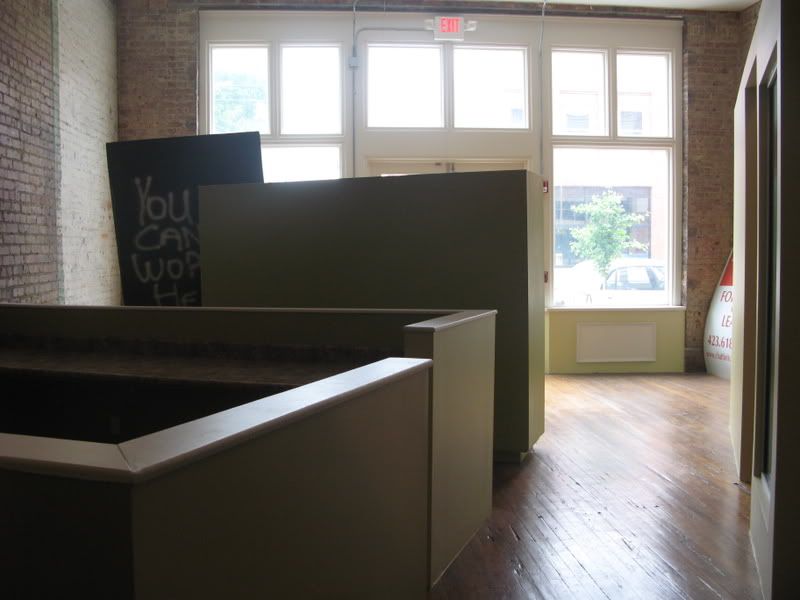
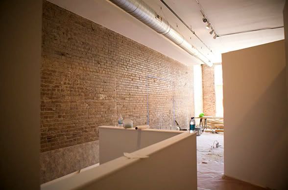
View looking in...before we had 4 "walls" knocked down:
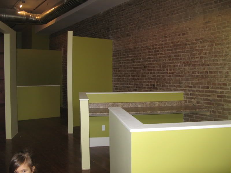
After:
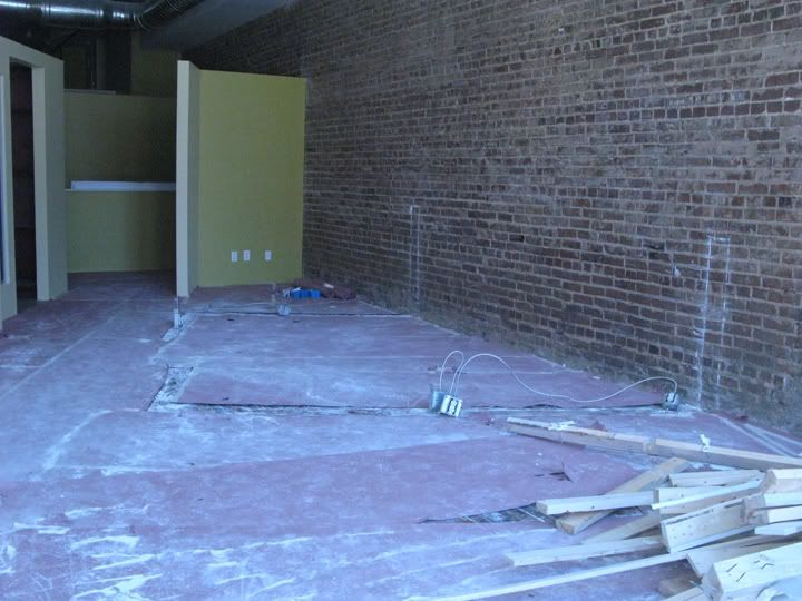
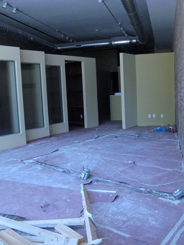
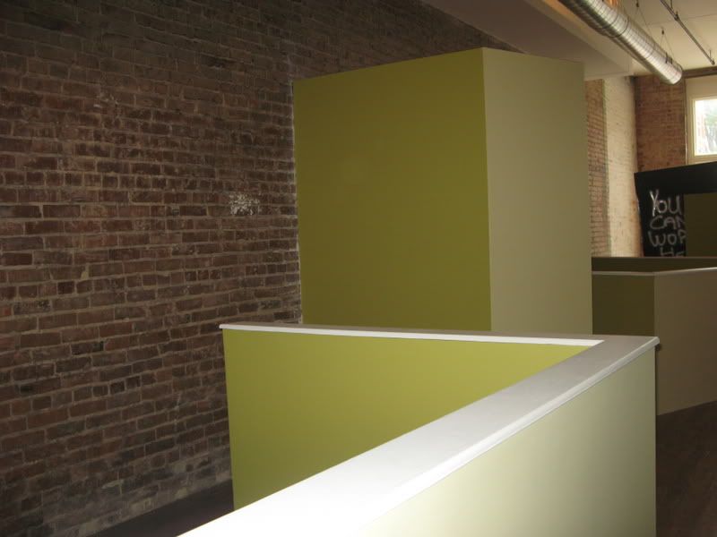
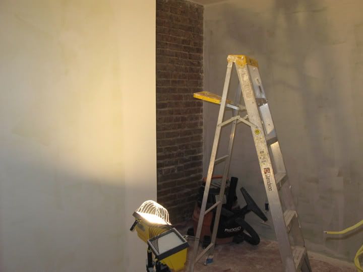
Down the hall...repainted the whole studio, got rid of the green paint and substituted with lighter colors for a fresh look:
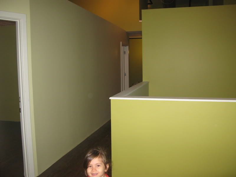
View from reception area towards front, all the walls on the left are gone now!
After:
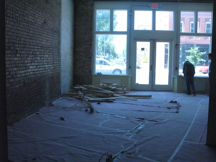
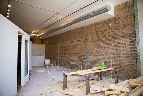
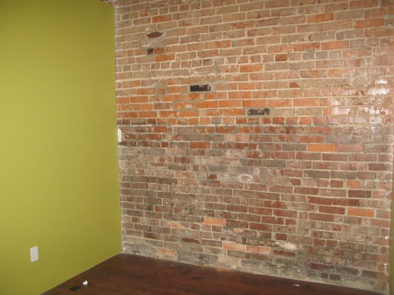
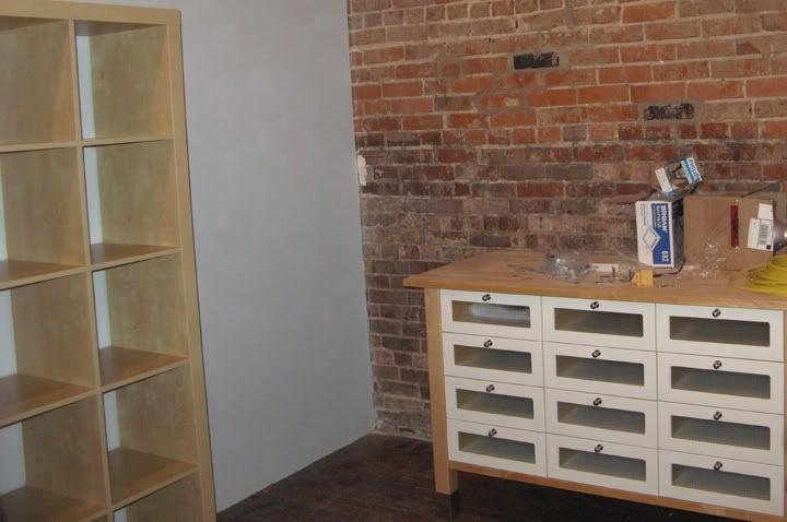
Before photo of the future workroom:
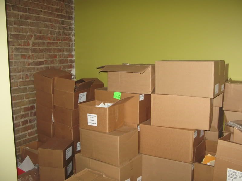
Another room, this is where we added the bathroom:
After:
What we found in this studio, answers for above:
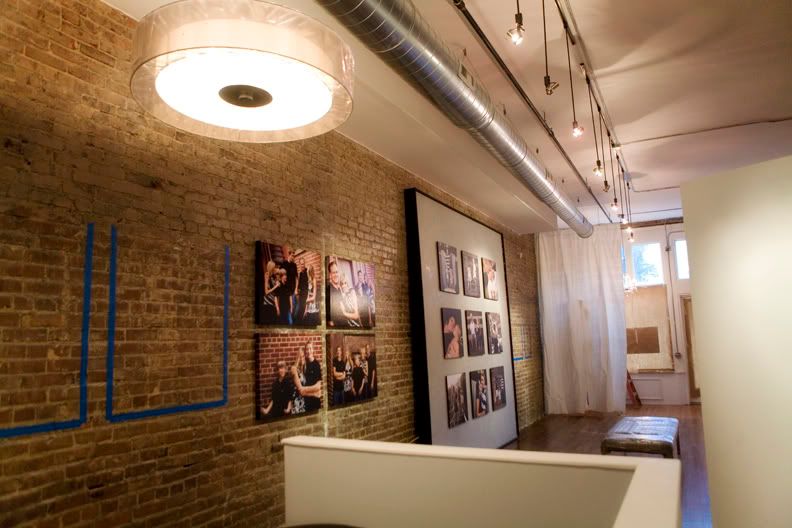
1) The characteristics: exposed brick walls on both sides of the space and in each room. Hardwood floors throughout and a charming area on Main Street. See this blog post with photos of Main Street.
2) A storefront on historic Main Street with boutique shops, arts district, and a green-living community.
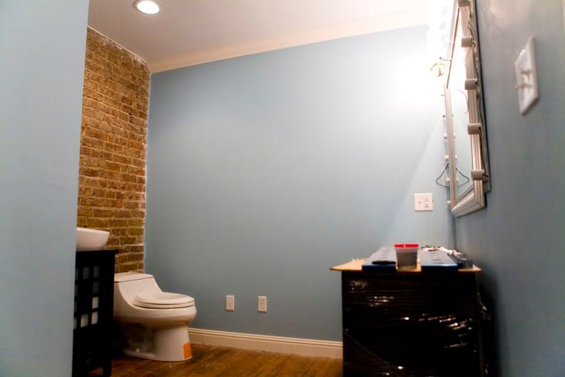
3) We added a bathroom to this studio, (we had two in our previous studio space). We saw so many commercial spaces that had public bathrooms that were separated from the actual space and had to be shared with other businesses. There is a bathroom directly behind us, but it is shared. Having our own bathroom was a must, enough said!
The newly added bathroom a week ago:
4) When you first walk in, you see the gallery space with a clean modern bench seat. We wanted a museum gallery feel, as well as room for special events such as hosting our workshops and others, open houses, portrait parties, etc. And plenty of space to display!
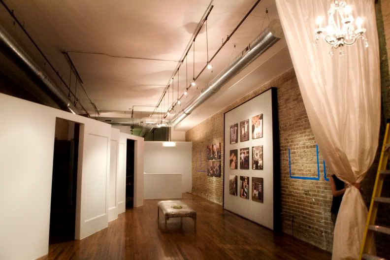
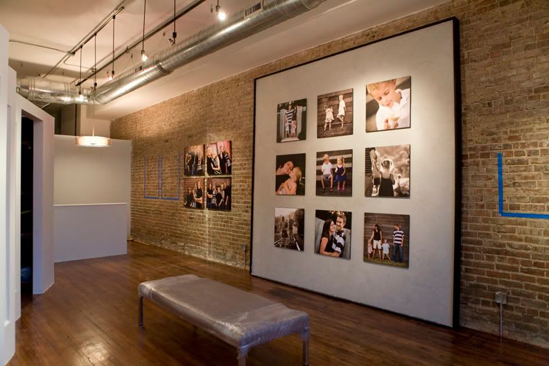
5) There is a workroom and adequate office area for future employees. We also made sure there is plenty of storage space for products and such to meet the studio’s growing needs. We also have an office, but no photos yet.
6) The studio faces South and there is plenty of light shining in through large windows at the front of the studio with custom silk curtains to soften the light. Plenty of opportunities for photographing!
7) There was a business who had previously occupied the space, so it was already equipped with phone lines, electricity, plumbing, walls, etc. We wanted to find a space that we can renovate minimally and make it our own. After we had drawn plans for a complete build out at the other “perfect studio spot” that was exhausting enough.
The spaces we are designating the studio for:
1) A gallery space
2) Presentation/meeting room with cyc wall (photos to come)
3) Waiting area for clients and kids (photos to come)
4) Reception area
5) Office (photos to come)
6) Workroom
7) Bathroom
7) Small kitchen area (photos to come)
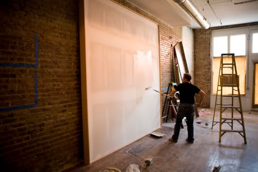
As you can see, the studio isn't quite finished with decorations yet and there will be more photos once the furniture are moved in and certain rooms are finished, (presentation room, office, waiting area, etc). There is even a built in cyc wall which is a bonus! (Cyc wall is curved, seamless wall and floor used as a backdrop also known as infinity wall).
There were many things we wanted for our next studio, but as we prioritized, these were the most important based on what we learned from our last space. We have grown and learned so much these past couple of years and our goal is to provide a unique experience and environment to our clients and to us as business owners.
Finally, I just wanted to give a shout out to Garrett who has worked so hard at this! Learning to hang dry wall, adding a bathroom, and juggling family, work, and photo sessions all at the same time. He is definitely passionate about his art and I am so excited to see our dreams become a reality. Also, thank you to all who have helped us, (family and friends) especially our wonderful, intern, Courtney, who has also dedicated so much time for this. We are so blessed to have so much support from all of you!

12 comments:
That really is a beautiful space. So Chattanoogaish!! Congrats.
I like the "before" look better.
Congratulations, you two. It's looking great and I can't wait to see the finished product! Ooh, how about some neighborhood photos as well? (:
Congratulations guys... it looks amazing! What a perfect place for your new studio. I can just see you growing and thriving there. I can't wait to see how it all looks when it is finished. You two are doing a great job!
Congrats! That is a beautiful space!
Looks awesome, guys! You continue to be an inspiration!
Blessings in the new place-
Brandon
How awesome is that! LOVE it! You guys rock! The entry of that space reminds me a bit of Curt's place... very cool! :)
Looks awesome man! I'm excited for you guys! I can't wait to see it in 3-D.
I know the new space has been a labor of love but, from my perspective, it looks well worth it.
I feel personally gratified that you found a space worthy of the Nudd's!
Wow...looking Awesome! I know how much work it is right now...just know it is totally going to be worth it!!
Looking forward to the opening :)
Absolutely LOVE it! My favorites are all of the detailed finishes - the silk drapes as you enter, the crystal chandelier, the modern bench, and the gallery white walls against the exposed brick. Can't wait to see the finished space! Thanks for sharing!
Being in the process myself I definitely side with the craziness! Your new space looks amazing and I can't wait to see the rest of the images when it's all done. I LOVE the collage piece on the wall. Bummer, I think D and I might have to come down to see it in person sometime.... ;) So haoppy for you guys, it looks amazing.
Post a Comment